
Web Design: The Colour Psychology for Your Business Colours instantly relay an impact to the visual views of the audience. It extends a feeling, a thought, an impression and sometimes a judgment. Colours contribute to the brand image of the business. It also helps attract the right target market. Colours are used not only for aesthetic but rather, it is utilised to project a sense of character to a place, a thing, or a brand. Every colour pertains a certain psychological impact on people. Set for example the colour red. Red projects a sense of urgency and sometimes can be seen as a sign of danger or mistake. Fast-food chains often use red to impose that it is a fast-paced environment. People come to eat and leave. It is not a place for dinner engagements that require hours of chatting and drinking wine. Thus, red is a common colour used to project the need for making an outright decision quickly. Your online profile must project the image of your brand. It has to be cohesive to your products, marketing scheme, target market and brand image. The design of your website must be carefully curated to instantly impact and indulge interest to your target consumers. Hence, colours need to represent your brand adequately. The Importance of Colour Psychology Colour psychology is an important tool in effectively magnetising your target market. A large percentage of consumers get influenced by colours in making a purchase decision. The first thing the people look at when deciding on buying the product is the appearance. It has to appeal to them in such a way that will drive them to consider buying. The second thing consumers consider is texture. Consumers will touch the product and see whether it has a smooth, a rough, or even a comforting surface. The last thing they will check is either the smell of the sound of the product. Thus, within the 90 seconds of observing the product, subconscious judgment from the viewer will happen and the colour is one of the major aspects that will leverage your brand image and recognition. Colour increases the chance of the brand to be distinctly recognised. The colour you choose for your brand will have a lasting impact on your market. It will help your brand build a unique image to your target market. Colours in Web Design Colour can significantly improve comprehension, learning, and readability. Strategically combining multiple colours and placing them accordingly will help in designing a clear visual impact to your audience. Colours will project the intended brand image. Identifying the best colour to represent your brand will aid in effectively reaching your potential buyers. Thus, it is best not just to pick a random colour from the colour wheel, rather, it’s ideal to research the psychological value it represents. Primary Colours and Their Meaning RED Red is a tenacious colour that arouses strong emotions, increases appetite, elevates passion and intensity, and also a symbol of love. Red in marketing is an effective aspect creating a sense of urgency that effectively works to impulsive shoppers. Red is also utilised by restaurants to increase appetite and intensify emotions. Red is an ideal colour if you want to project an urgent call for action. One of the nice examples of website in this colours is website of australian company Prompt Glass. YELLOW Yellow is a mellow hue that delivers warmth and cheerfulness. It also helps stimulate mental processes and vitalise the nervous system. Additionally, yellow is also one factor that encourages communication in certain situations. On the other hand, too much yellow can cause eye strains and fatigue. Yellow in marketing is a good representation of youthfulness and optimism. It can also aid in grabbing attention to passersby. Moreover, yellow adds up to the clarity of the message the brand wants to share to its target audience. BLUE Blue is often associated with peace and calmness. It is also the preferred colour of the male market. However, blue is not an ideal colour to represent food. It slows down the appetite substantially. Blue also plays a role in the human perspective of life on Earth. The sky and the ocean are concrete examples of such perception. Blue in business is an effective colour in increasing productivity due to its non-invasive quality. It is also used by brands that want to establish credibility and trust. Blue brings a sense of security to the eye, hence, blue is optimised to create a reputable brand image. Secondary Colours and Their Meaning ORANGE Orange is a cheerful colour that also evokes excitement and warmth. Orange could sometimes present a warning or caution effectively. Orange in marketing is useful for a call to action buttons since it signifies aggression at a certain level. Additionally, orange also flaunts a cheerful, friendly, and confidence. It is an ideal colour for brands that offers happiness to its target market. GREEN Green presents tranquillity and health. It also symbolises money and new growth. Green is also an effective colour for an office space. It creates a sense of serenity and clarity. Green in marketing is effective for projecting calmness in the environment. It is also a good representation of money. Thus, many banks choose green in their logos. PURPLE Purple is a symbol of royalty. Thus, it shows off wealth, success, and wisdom. Purple in marketing projects creativity and beauty. It is used to persuade beauty product consumers. Purple also helps evoke calmness and soothe moods. Colours are vital in designing a website. It is the first thing that catches the eye of the audience. Colours must be strategically chosen to effectively represent your brand. Adam WestormAdam Westorm is a versatile designer and writer at One Deep Design with over 10 years of expertise in the creative sector. Holding a Degree in Creative Industries,
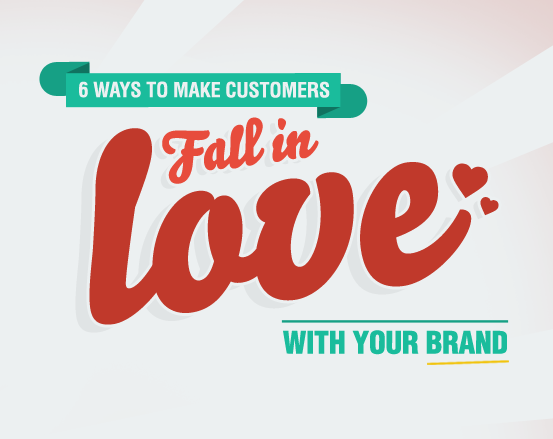
[INFOGRAPHIC] 6 Ways To Make Customers Fall In Love With Your Brand
Have you ever wondered why some brands have a cult like following, while others struggle to get any recognition? Well, here are six ways to dramatically improve your chances of becoming a sought after, loveable brand. While some of the statistics we uncovered were expected, others really gave us a shock. For example, did you know adding a testimonial to your website could increase sales by up to 250%? – This happened to one of our customers Click on the infographic to view full size version. Fast, hard-hitting tweets to engage your followers. More than 90% of buying decisions are influenced by visual factors. 73% of customers love a brand cause of friendly customer service. 70% of customers prefer getting to know a company via articles rather than ads. Customer loyalty can be worth 10 times as much as a single purchase. Adding testimonials to your website can increase sales by up to 250%. Adam WestormAdam Westorm is a versatile designer and writer at One Deep Design with over 10 years of expertise in the creative sector. Holding a Degree in Creative Industries, Adam specialises in building authentic brand identities that resonate with modern audiences. He is known for his collaborative approach and his ability to translate complex business goals into clean, sophisticated designs and sharp, engaging copy. Based in the creative heart of the agency, Adam is committed to delivering bespoke solutions that elevate a brand’s digital presence.
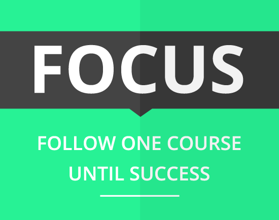
Why We Had No Choice But To ‘Niche Down’ & FOCUS
When we’re wet behind the ears and only beginning to make waves within our industry, it’s hard not to jump at every opportunity that comes our way. Our minds are programmed to be constantly churning out new ideas and fresh formulas to attract more customers and tap into a bigger share of the market. But what if these opportunities and ideas are only distractions in disguise? The more the merrier. Most of us have considered and usually followed through with either adding a new service, introducing a new product, loosened the criteria of our ideal customer or possibly even started a second company. After all, it does seem like another way to grow our business and capitalize on the opportunity at hand… Well in 2010, One Deep Design was a prime example for this train of thought. We decided to expand our list of services to include just about everything that fell under the creative title. We went from a no frills graphic design company to offering graphic design, photography, print management, web design and SEO. We were exactly what our business cards said, ‘full service creatives’. And if you asked us who we work with, we would of very broadly told you, ‘small to medium businesses within Australia’. What were we thinking? Like many, we believed to increase our workflow we would offer more services and cater to a bigger market. We were certain this was going to open our doors up to acquiring even more clients and make us look like a big player within our industry. Well, not so fast… We soon realised this wasn’t going to plan, regardless of how good it sounded in theory. We weren’t acquiring customers at the rapid rate we had originally envisioned; in fact there was very little improvement at all. The problem with a ‘we do it all’ approach is, it is easy for people to get the wrong impression. Everyone presumed we knew a little bit about a lot, but not a lot about anything. No matter how knowledgeable and capable we were with each one of these services, the message wasn’t getting across. The reality was we hadn’t made an impact in one market alone, yet we were attempting to tackle 5 individual markets head on. We were a small business with no defined niche, in an extremely cutthroat market. Without specialising in anything we didn’t have an edge – this was a problem. This called for us to take a step back and look at the bigger picture. The way we had positioned our company was holding us back from growing to the scale we had planned on. It was time to ‘niche down’ and get very clear on who we wanted to appeal too. Putting on the blinkers. To get things underway our first step was thinking about the projects we loved to work on and the projects we despised. For us, the brand design projects have always been most exciting as we can ultimately shape and improve the entire image of a company. The effect this has on a company is massive and it’s something we enjoy being a part of. These types of projects also take up a good chunk of time so we don’t have to focus on bringing in plenty of smaller jobs to fill up the day. The time factor also means we form a better relationship with our clients, which often leads to many things such as referrals and ongoing work. It had become clear; narrowing in on brand design was one step in the right direction. Then along came the tough questions… Who do we enjoy working with and helping? Is their a particular industry we gravitate towards? Is there a group of people we can relate to more than others? What inspires us to create exceptional results? After going through a healthy pile of notes, we noticed a common theme pointing towards one group of people. It was obvious our ideal customers were the entrepreneurs of Australia. While I have simplified this a lot, it wasn’t a simple task we mashed out in one afternoon. It was a lot of ‘humming and hawing’ that took us close to two weeks to really narrow down and be confident about a newly targeted approach. Without sounding too dramatic, it did require huge amounts of thinking and a complete mind shift from previous ideals. Brand design for entrepreneurs: a micro-niche is born. Since identifying our micro niche we are now perceived as specialists, instead of the guys that will take anything you throw their way. People can see we create brands all day everyday, so naturally presume we must be damn good at it! As a result of niching down we now land more of our bread-winning projects and work with other entrepreneurs who are passionate about what they do. For us, it’s a good place to be right now. Fear of missing out. For some, the idea of ‘niching down’ seems like a bold move; it’s what we call the fear of missing out. They are afraid that if they give their long list of services the chop, or get specific about their ideal customer, work will dry up all together. However it is much the opposite, I would like to share with you one paragraph from the book ‘Become a Key Person of Influence’ that I believe hits the nail on the head… “Use a sniper rifle, not a shotgun. Intuitively, people believe that taking a general, encompassing approach is more effective, but evidence shows it is not. When you try to catch everyone in your net, you catch no one. The ‘cast your net wide’, or more graphically, the heavy artillery shotgun approach to business is well and truly dead. A broad approach is especially ineffective when you are starting out. You need to become a laser-sharp marksman focusing on a very specific micro-niche.” It was this fear of missing out that motivated our initial change in